17 Best Travel Blog Website Designs (2019)
April 7th
Andy
Offsprout is the only WordPress website builder for freelancers and agencies.
There are a lot of travel blogs out there covering a wide range of niches and topics.
So, how can your travel blog stand out?
Our team looked at a ton of travel blogs. We saw a lot of great sites. And some that were amazing, and really attention-grabbing.
To give you some inspiration for your own travel blog website, we’ve compiled this list – 17 Best Travel Blog Website Designs.
These blogs are our favorites purely from a design perspective. Keep in mind that this list is not meant to be a rudown of our favorite travel blogs from a purely content-related perspective. This post is meant to be a look at travel blogs purely for website design, functionality, layout, and aesthetic purposes.
Also, in reviewing these sites, we’ve seen the elements common to the best travel blogs. Before diving in to our favorite sites, we have recommendations to share to help with your travel blog website.
What Makes a Great Travel Blog Website
Looking through the best travel blog websites, a lot of them shared common elements.
Here are some recommended elements for your site so you can create one of the next best travel blog website designs.
A Good Camera and Pictures

Pictures are everything.
Look at any travel blog, and you’ll see the big focal point is the pictures.
If you want to have a great travel blog, a good camera to take high-quality pictures is a must-have accessory.
The layout of your website should highlight these photos.
Storytelling
Aside from the pictures, what story is there to tell?
Pictures on their own are great. But pictures without a story to tell might as well just be a desktop background. Sure, it may look nice, but the story adds a lot more depth to it.
Most travel blogs have a niche or theme. Share narratives related to that niche and theme.

Mobile-Friendly
A lot of your traffic will be coming from mobile devices.
Up to 70% of all web traffic now comes from mobile devices.
For travel blogs, content often gets shared and viewed through social media. Over 80% of social media traffic is now from mobile devices.
So, ensuring your site looks great on mobile is a must.
It’s not just important that your website layout be “responsive” so it looks good on desktop and mobile. It’s important that when you build your site, it is built with mobile in mind.
In particular, when designing your site, you should be testing it from mobile devices. Just because a site looks great on desktop does not mean every element will line up exactly how you want them to on mobile.
You may find that with your mobile-responsive site you need to make certain tweaks to the mobile layout in case certain elements don’t display well on phones or tablets.

Layout
Your website layout needs to be built with all these elements in mind. It needs to be able to help you tell your story, show off your pictures, and ensure your site looks great on mobile.
Your site layout should be easy to view on any type of device.
If you are looking for an easy way to create a great-looking site and add new posts, check out the Offsprout website builder and tools.
Social Links
Social media is an important source of traffic for travel blogs. One website cites that on average, 13% of a travel blog’s traffic can come from social. Some travel obviously get more traffic from social. Others get less. It just depends how well you utilize social media.

Regardless, you should make your content shareable for social. Let people Pin your content to Pinterest, and share on Facebook or Twitter.
Engagement
An important element that many overlook when first starting their travel blogs is audience engagement.
Some of the best travel blogs have engaging comments sections where the author and readers can discuss the blog posts.
Engaging with your audience ensures they feel valued and come back.
Links
Great travel blogs also have outbound links to third-party content. Often, travel blogs use affiliate links for related products and services. They also link to other relevant websites related to your blog posts.
Linking out, aside from the referral revenue, is a great service for your readers, and can help you engage with other blogs or websites.
The Best Travel Blog Website Designs
Now, let’s dive in to our picks for the best travel blog website designs for inspiration.
Blonde Abroad
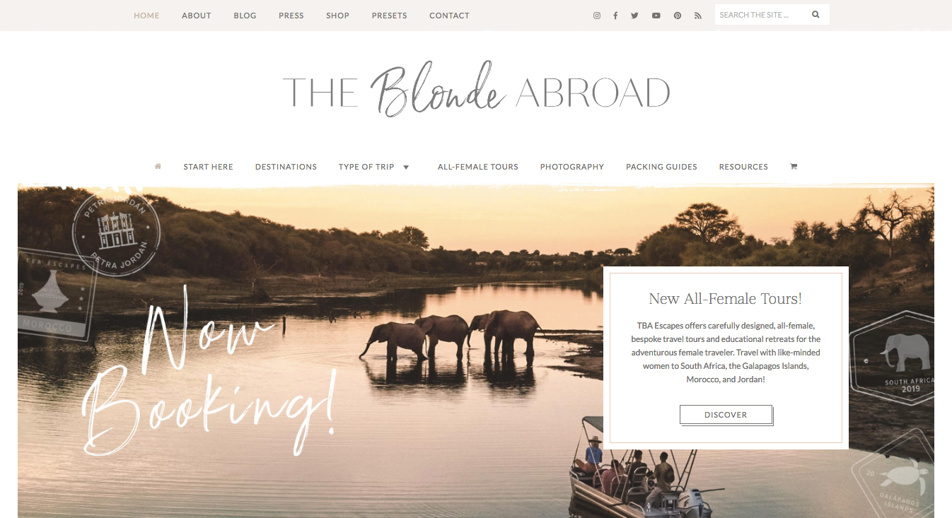
Blonde Abroad is a beautiful travel blog website. The site is geared towards female travelers, providing specific tips and recommendations, as well as sharing the author’s travels around the world.
This travel blog definitely has some serious production value. Beyond having good images and content, the site has some additional features that set it apart. The homepage has custom graphics and iconography, an interactive map, and social page integrations. The custom graphics really make the site unique.

Additionally, the homepage has a section featuring the blog’s Instagram feed, which has more pictures and content.
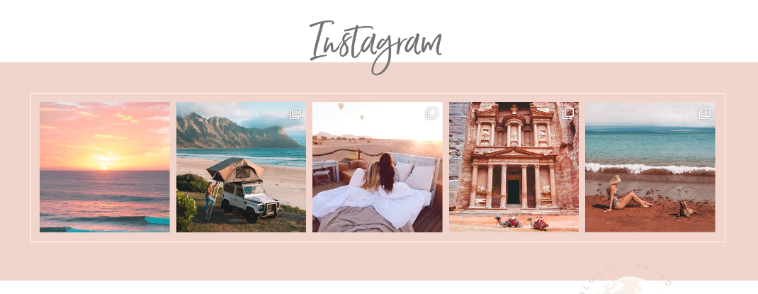
One thing that was interesting about this blog is that it has a ton of content. With so much information, it could be easy to get lost. One thing that the best travel blog website designs do well is how they organize their content. This blog has a breakdown for specific destinations, as well as types of trip (e.g. budget, female, solo, adventure), packing guides, and resources.
Let’s also not forget to mention the great photo and text content on the website. For a travel blog, it’s a necessity. This travel blog has personality and it comes through in the content, setting it apart. It’s not just a collection of pictures. There’s a story behind everything.
Along Dusty Roads

This travel blog stands out for its amazing images and beautifully minimalist-inspired layout and design.
Dusty Roads is a travel blog run by a couple that travel the world, creating travel guides and photo journals.
The site layout has a very different feel from, say, the Blonde Abroad blog. This site has a more modern / minimalist look.
There are photos, text, and a ton of white space.
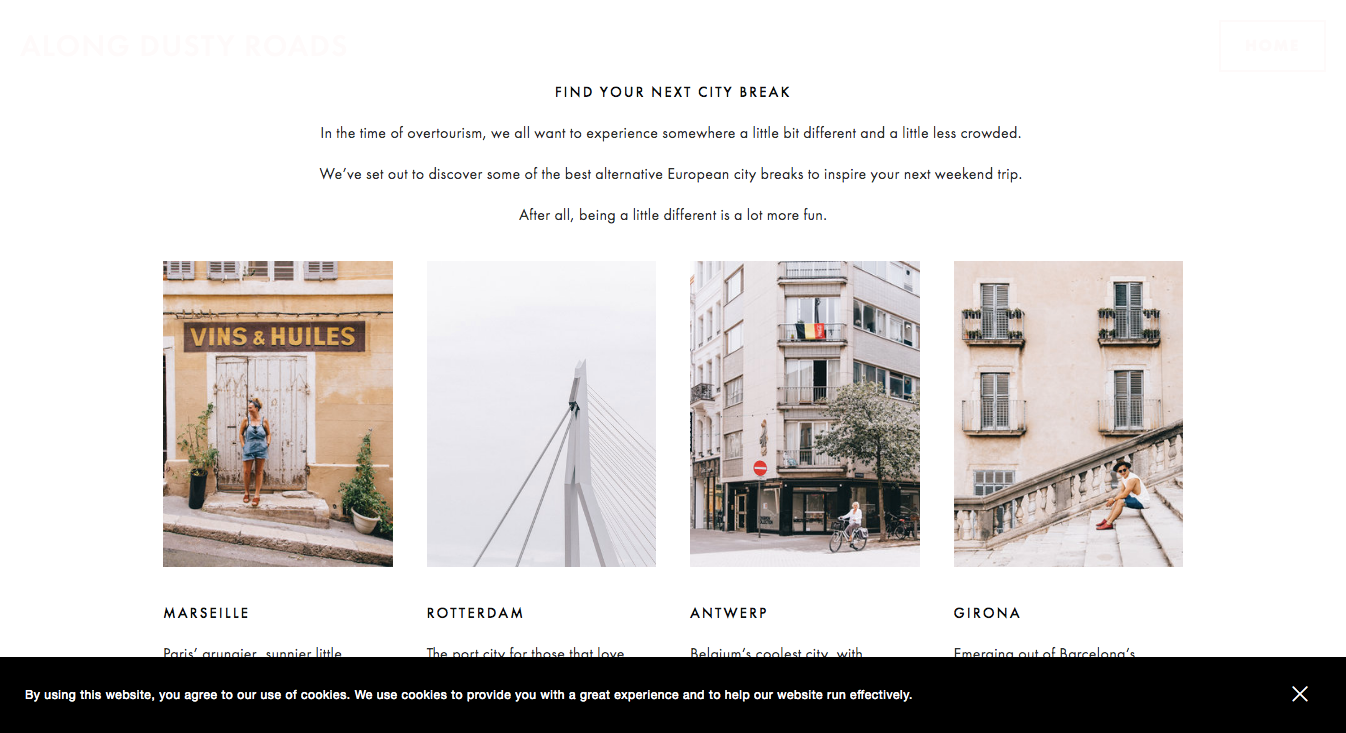
On this travel blog, the pictures do the talking. There’s little else on the travel blog layout to get in the way.
The white space and small text with tons of white space make for a real sophisticated look that makes the images pop.
This blog shows you that there’s not just one way to make a travel blog. You can get creative, with a design that’s outside-the-box.
You don’t need to overrun your site with photos and have flashy graphics and backgrounds. Sometimes taking a simple approach can be perfect.
Looking to create your own Travel Blog?
Visually design your travel blog with ease. Get started for free today.
Sidetracked

Sidetracked is a travel magazine website with gorgeous photos, travel guides, interviews, and personal essays.
The site and each of its articles have simple yet elegant layouts. The interplay between the text essays and striking images is done very well.
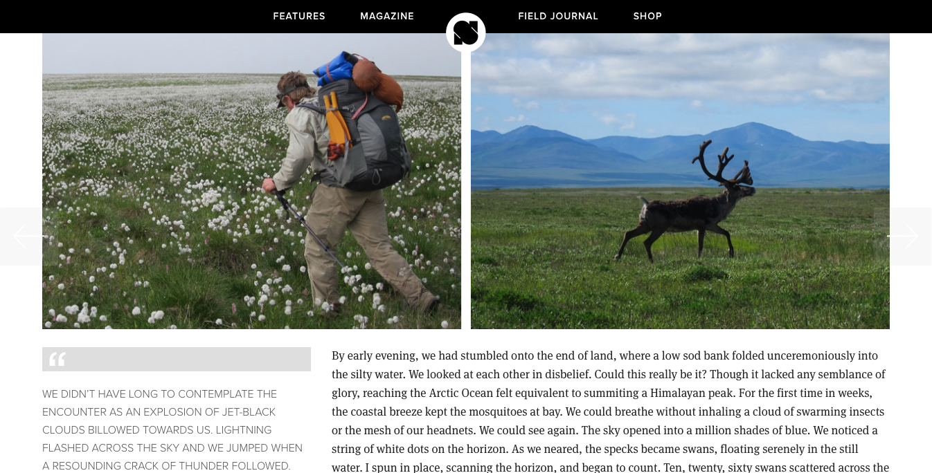
In each of the articles, you’ll see things like pull-quotes to the side, with images and content artfully arranged.
Scrolling through an article feels like you are almost reading a physical magazine.
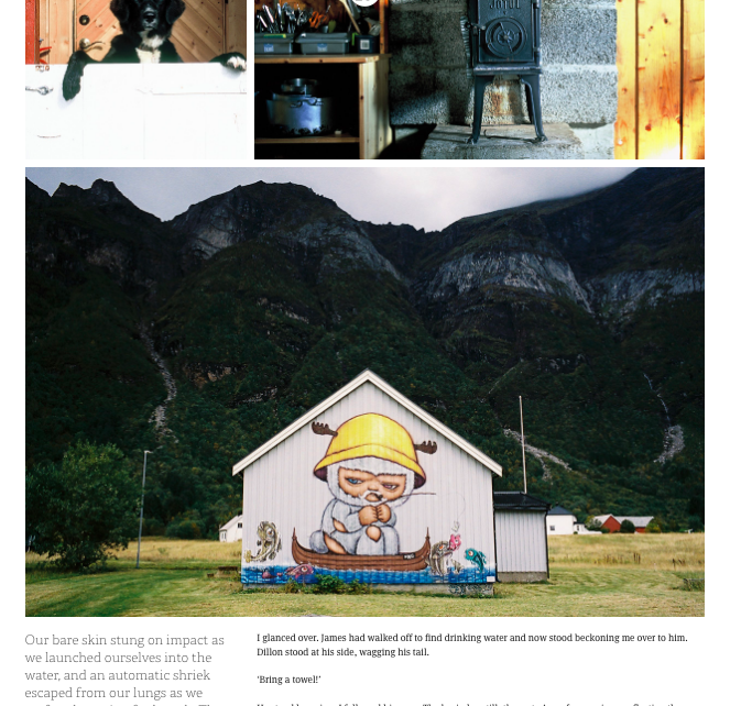
Here, similar to the Along Dusty Roads travel blog, you have a site that focuses on highlighting breathtaking images, along with text that helps tell the stories behind the photos.
The layout lets the photos and text shine, and doesn’t get in the way.
Stuck in Customs
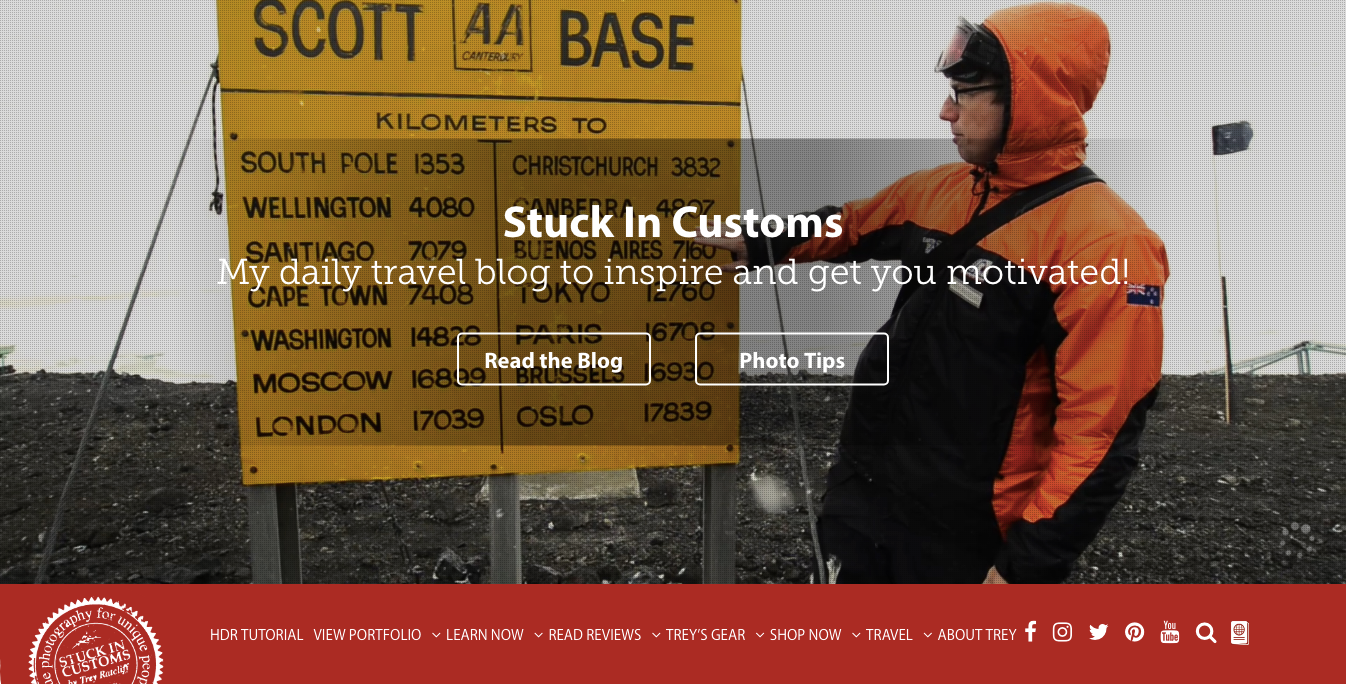
This travel blog is one of the most popular, if not the most popular travel photography blog out there.
Stuck in Customs is a travel blog focusing on photography, and it has a ton of content to share and highlight.
Since photography is the key focus, naturally, it gets a lot of attention. On this site, though, the creator does something particularly unique and helpful for the reader – he has detailed information alongside when you hover over a photo, providing details on the camera settings.

That’s a particularly thoughtful feature to have, and perfect for this blog’s audience. Elements like that help a blog stand out, and better connect with its target audience.
In addition to great photos, the blog features tutorials for readers so they can take better photos.
The site layout and design itself works great. Each page has a hero above the navigation, with a more traditional blog post format below the navigation – a sidebar on the left and right with the main content in the middle.
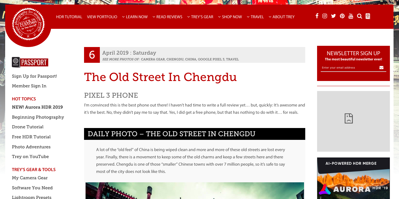
Like other travel blogs with a lot of content, it’s very important how you organize that content. If you’ve had a travel blog for many years, chances are you have a ton of articles that most people would not come across on their own.
So, this site does a great job of organizing its information, with a top -nav menu that breaks down categories of content, along with the left sidebar that highlights featured content.
After reading so many travel blogs in researching this article, it’s become very clear that being a good photographer and having the right equipment is critical.
The best travel blog websites all have amazing, yet high-quality photography.
It’s not just enough to be able to take a photo with a good camera in an exotic locale. You have to have a deep understanding of image composition and have an artistic eye for this.
Expert Vagabond
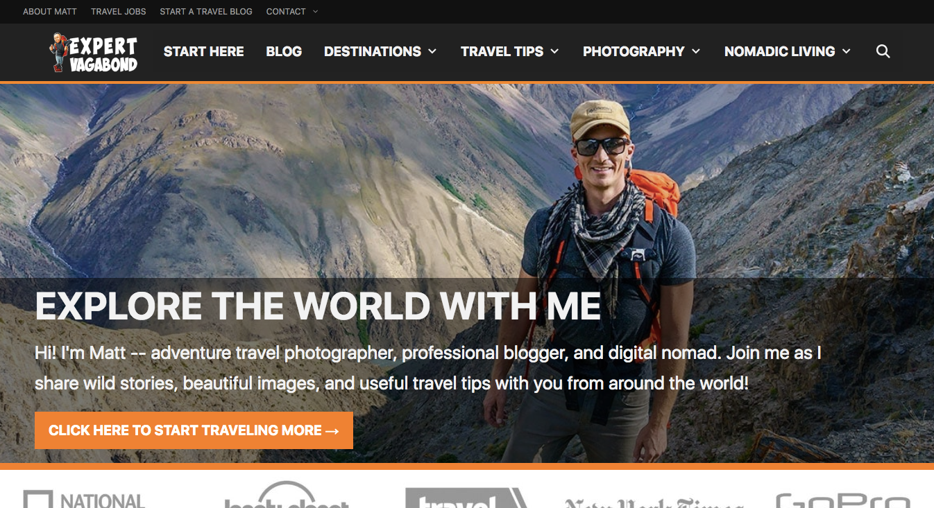
When I think of traditional travel blogs, I think of sites like this one.
Expert Vagabond is a travel blog that has budget travelers and digital nomads in mind.
Unlike many of the other best travel blog website designs in our list, this one is not heavily image-focused. The author has a lot of great stories and text content to share, and the site is built with that in mind.
Visitors coming to this travel blog are coming more for the information and travel tips rather than just great photographs. So, the content is highlighted.
On this travel blog, there’s a big main navigation menu at the top with drop-downs helping visitors navigate deep into the site’s pages. The site has travel guide features as well as sections on travel tips and being a digital nomad.
Going to any specific blog page, and it reads like a classic blog. It has a sidebar with links to popular posts, social media sharing icons, and a main section for the blog post content.
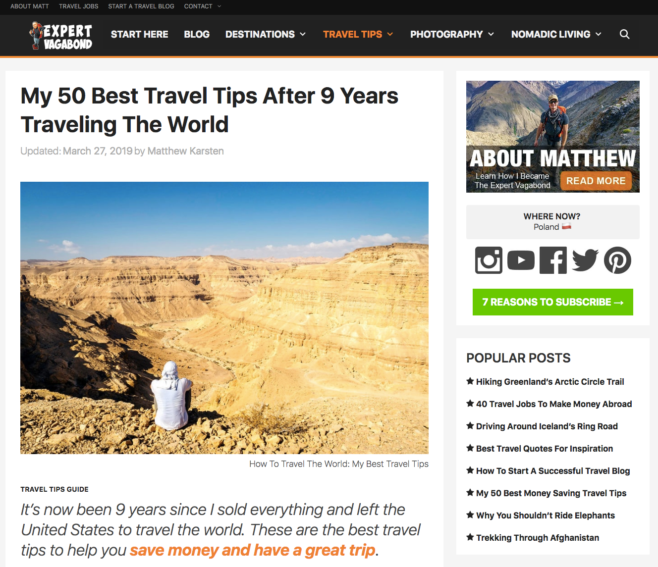
Sometimes the best travel blog website designs are not the most avant-garde. Here, a classic blog design works great.
The site does make use of custom graphics and imagery. Sidebar images serve to link to other blog posts, and have superimposed text.
Tiny Atlas Quarterly
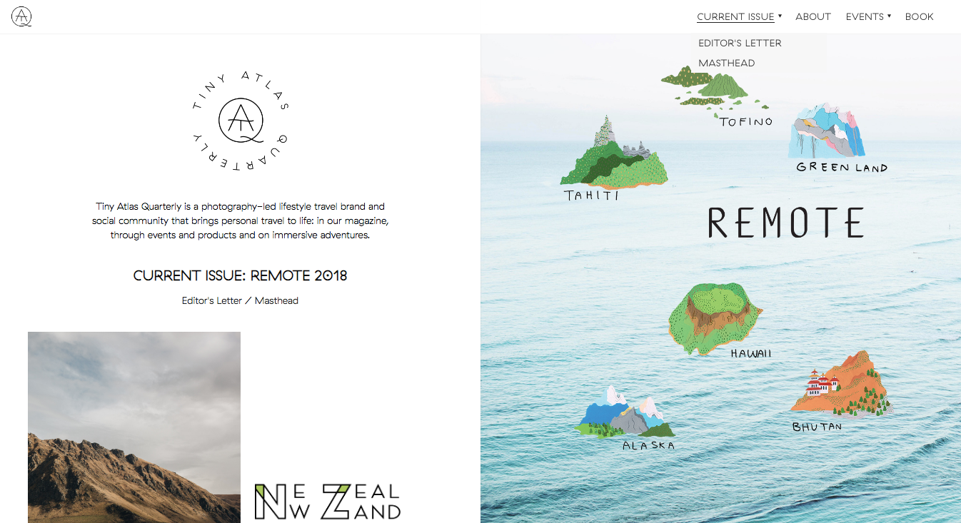
This site is a photo-focused travel blog, helmed by professional photographers documenting their professional journeys.
Tiny Atlas Quarterly has a minimalist style layout with great composition, use of striking imagery alongside simple text and white space.
What makes it one of the best travel blog website designs?
Check out this site’s style. “Sometimes less is more” as the saying goes. The homepage has a minimalist look and feel, which showcases the photographs. Too much by way of background or text or graphics would dull the impact of the photos.
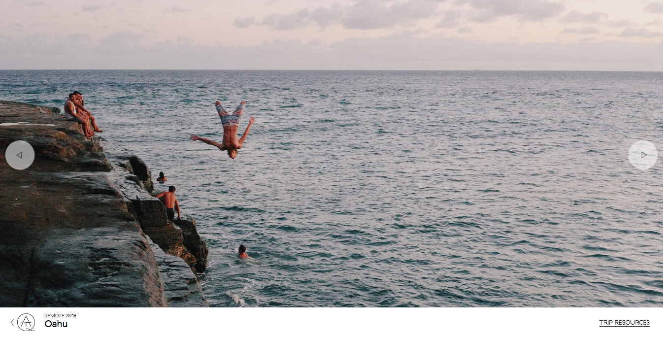
Going into a blog post, you may see a large image slider taking up the page’s real estate, giving it a look and feel as if you are watching someone’s travel slideshow.
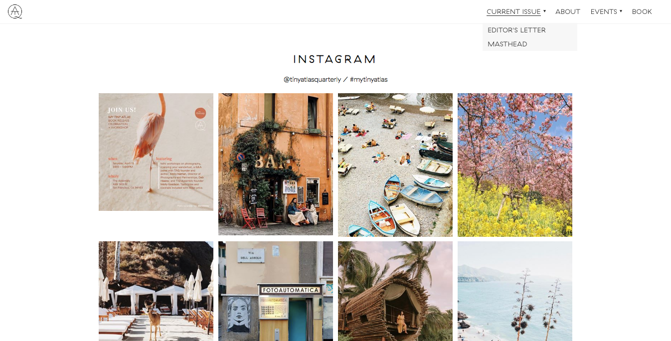
In addition, like the Blonde Abroad blog, it has an Instagram section at the bottom of the homepage to highlight images the blog has shared on social media.
Travel Freak
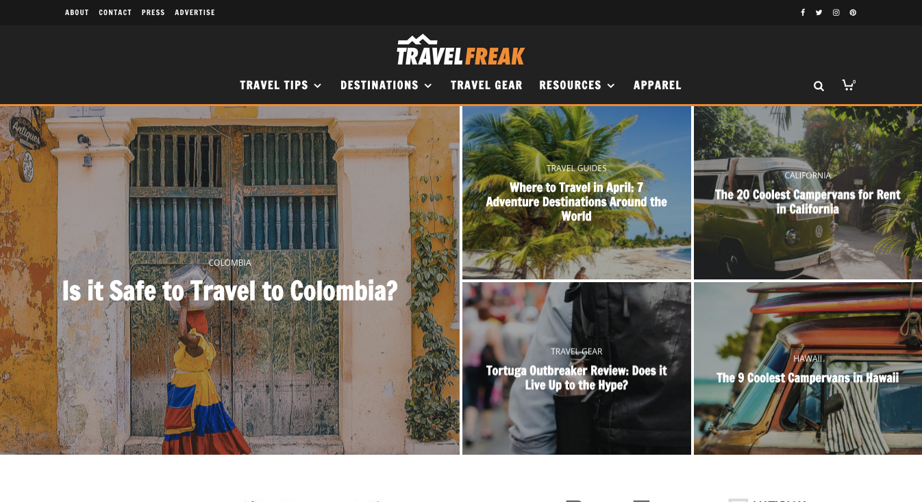
This site has a very different style than some of the other travel blogs in this list. While it does tend to highlight photos, its interior pages, the blog posts, are more traditional blog style formatted.
Travel Freak is a travel blog geared towards adventure-seekers – digital nomads, backpackers, and budget travelers looking to explore the world.
Let’s talk about this site’s homepage. The top hero area highlights recent and popular articles in a visually impressive layout. Below that, it has sections for “Essential Reading”, links to their store, and below that, links to more content.
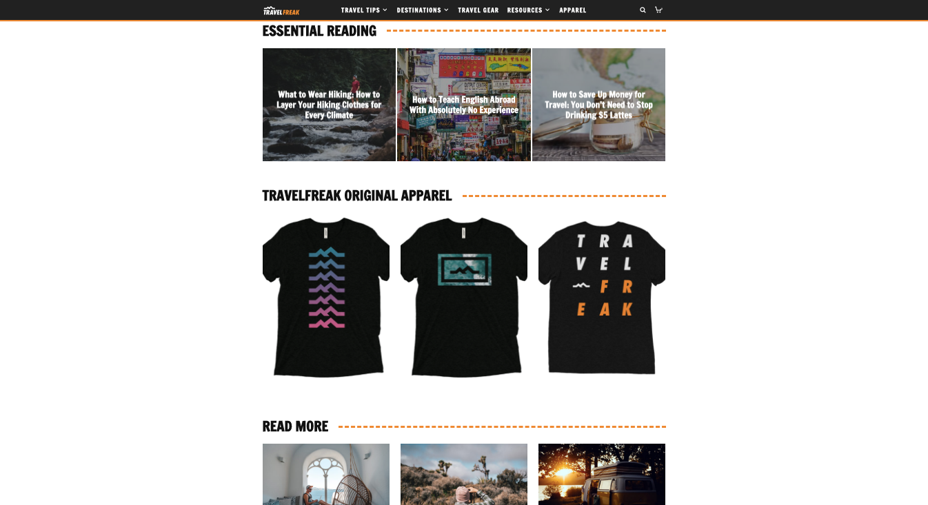
The organization of it works well. While it can be tricky to interpose an online shop between text and photo content, this site does it well. The site mentions its online shop, but it doesn’t come across in a cheap or overly self-promotional way at all. Sometimes travel blogs can really go overboard with pitching their for-sale goods and services and turn off the visitor from the rest of the site’s content. But, this site does it well.
Our Wild Abandon
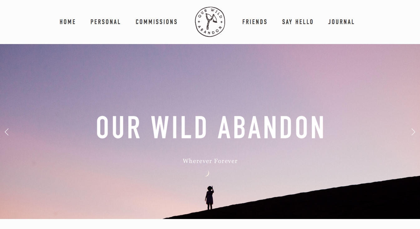
Our Wild Abandon is a travel blog with a more minimalist style and bright, colorful, impactful images that pop.
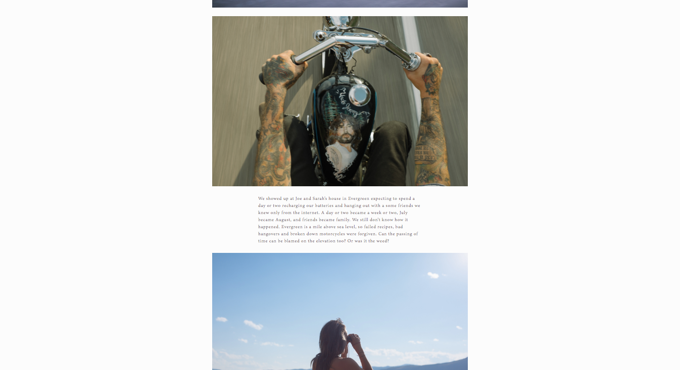
This travel blog, created by two photographers, is another example of a travel blog that highlights photos. The blog posts have a simple, straightforward design with large images and smaller text captions.
It’s got a very “photo essay” style to it that works well with the site’s high-quality, great-looking imagery.
The muted background serves as an unobtrusive canvas for the photos, letting them shine. This site is another that exemplifies the minimalist “less is more” idea, that you do not need to have a busy layout to impress your visitors.
Just One Way Ticket
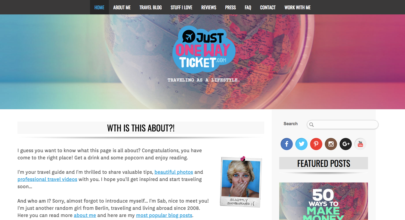
This site highlights different styles of content, and it contains them well.
Just One Way Ticket is a travel blog that has incredible videos in addition to text-and-photo travel guides common to many travel blogs.
Managing text, image, and video content throughout a site can be a bit trickier than just text and photos, but this site does a great job. All of the content is professional-grade. Seeing such great-quality, professional videos really makes this site stand out in particular.
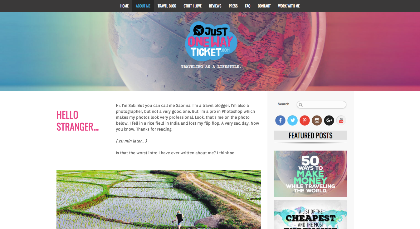
The website has a bit of a more fun theme, like it’s not trying to take itself too seriously. The graphics and color scheme are bright and exciting.
Comparing it to some of the other blogs, it made us realize that many of these travel blog website designs can convey a more serious tone. This one is more adventurous, exciting, and fun. It goes beyond just saying “We’re an adventure blog,” which many do and convey with striking images. Due to the colors, font, and tone of the text content, and visuals, the site seems to convey a bit more excitement.
The blog posts have a traditional main content + sidebar layout, featuring social icons and featured posts on the sidebar alongside a search bar.
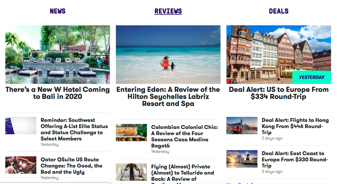
The Points Guy
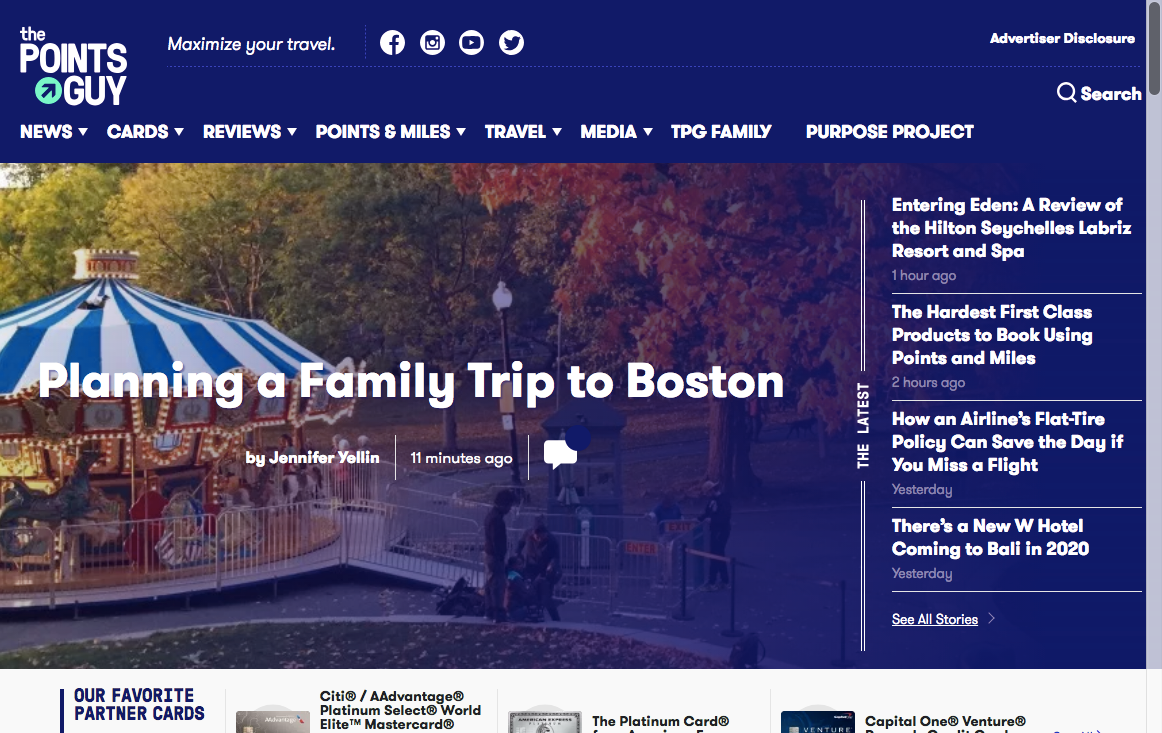
Here is a site with a lot of helpful information for travelers, that does a good job of presenting information that one could consider boring.
The Points Guy is a travel blog geared towards travel rewards, credit card points, and deals.
Most of the articles are about credit cards offering rewards points, tips on how to get rewards miles, and such. For a site with so much content about credit card rewards, it makes it interesting.
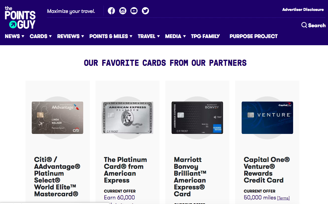
This site has a lot of content, and they are always adding more.
So what makes this site one of the best travel blog website designs?
This site does an excellent job of curating its content and getting its visitors to read and keep reading. It’s hard to visit the site and not read a few different articles. There is so much content about different topics, all geared towards helping people travel better.
On the homepage above-the-fold there is a sidebar with the latest content, with more articles below-the-fold broken down by topics.
Petite Passport
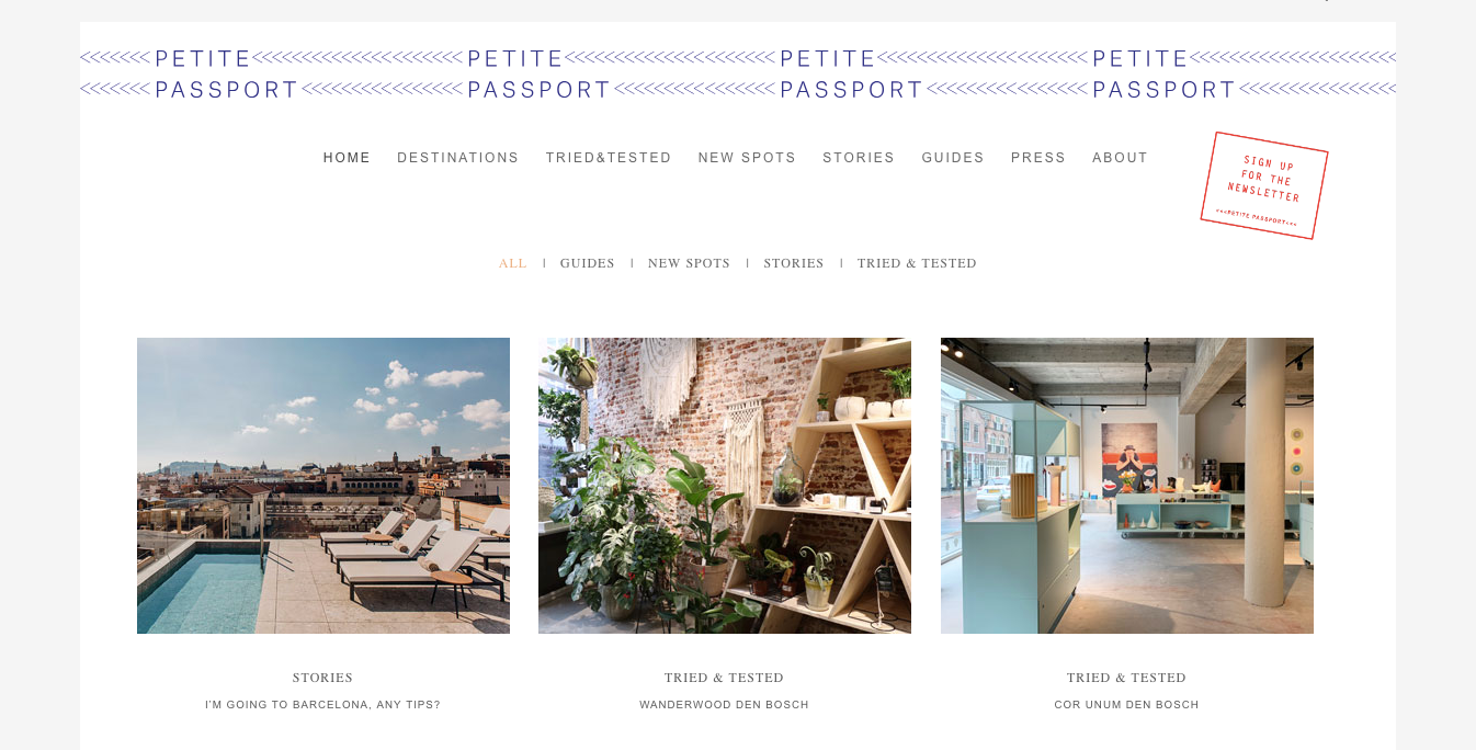
Here is a travel blog that is very design-focused. Petite Passport is a travel blog focusing less on the adventures of one person, and more on reviewing destinations, hotels, and beaches.
This site has a simple, refined, modern style. The main page content has a more boxed frame, with a white background. Outside the main page area is a gray background framing everything.
It does a good job with “passport” theme, having graphics and imagerey around the theme. For example, the site is adorned with passport stamp-like graphics.
When thinking about creating your own best travel blog website design, keep in mind your theme, and what touches you might want to include in your travel blog design to really make that come across.
Notes from the Road
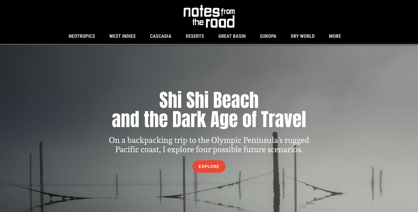
This travel blog stands out for its dark tones. The site background is black, which juxtaposes with essentially every other travel blog website, which has white or a light neutral color as the background color.
Notes from the Road uses black with grays and whites in its color pallete, along with a red-orange accent color. The black and whites make the accent color pop.
Notes from the Road is a travel blog focusing on detailed travel essays. The articles are less of a “Here’s what I did and what you should see when you go here,” format common to many travel blogs.
Instead, the articles feature rich backgrounds of the places being visited. It’s a more voyeuristic, observational look at the visited communities where the focal point is less on the author and more on the place being visited. As such, these locales visited are given a strong spotlight.
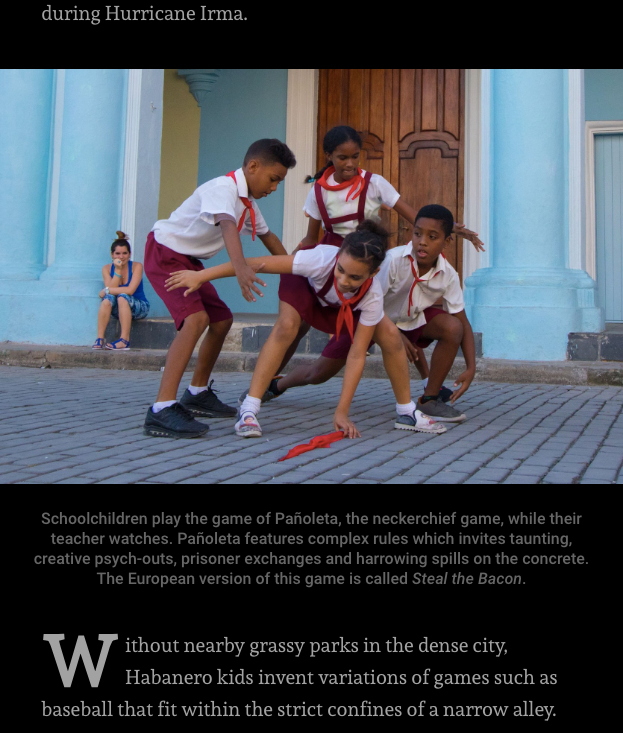
With the black background and sharp images, it makes the site almost look like a lightbox display.
One particularly interesting aspect is with the typeface choice.
Here, body text is in a serif font, while captions and headings are in a sans-serif font. Typically, websites like blogs use sans-serif fonts, but this one, with its Times New Roman-like font, comes across more like a newspaper or magazine.
It’s a unique choice that is executed well.
Johnny Jet
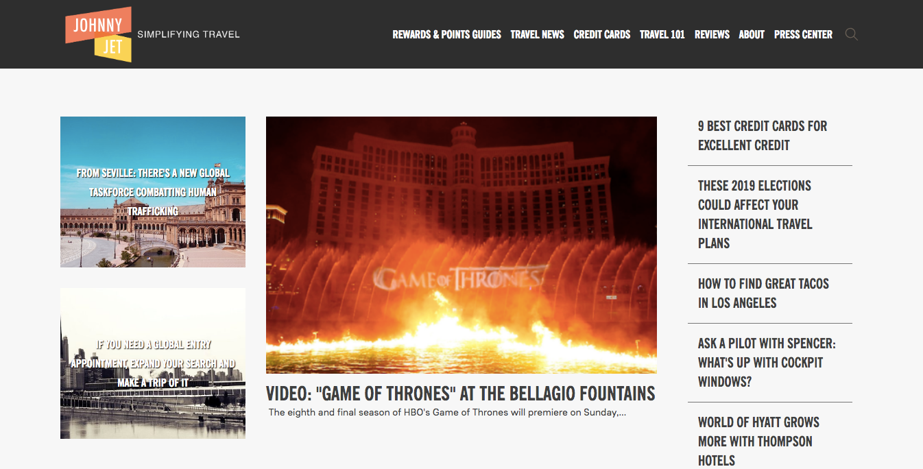
Here’s a website that focuses primarily on being a resource for all things travel. With a ton of information on topics ranging from travel points to credit cards to travel tips, this site organizes everything clearly.
Johnny Jet is a travel blog that focuses more on the logistics of travel than the destinations themselves.
As you can tell, though Johnny Jet and The Points Guy discuss a lot of the same things, the blog design for Johnny Jet is very different. Instead of having a bold color scheme, this one is more subdued.

The homepage has an interesting layout. The above-the-fold area has a bit of a news site feel to it, but it doesn’t go over-the-top.
Below-the-fold on the homepage are areas highlighting different categories of content.
Aside from the layout it’s worth noting the color palette. The colors – gray with an orange accent – is an attractive visual.
Dan Flying Solo
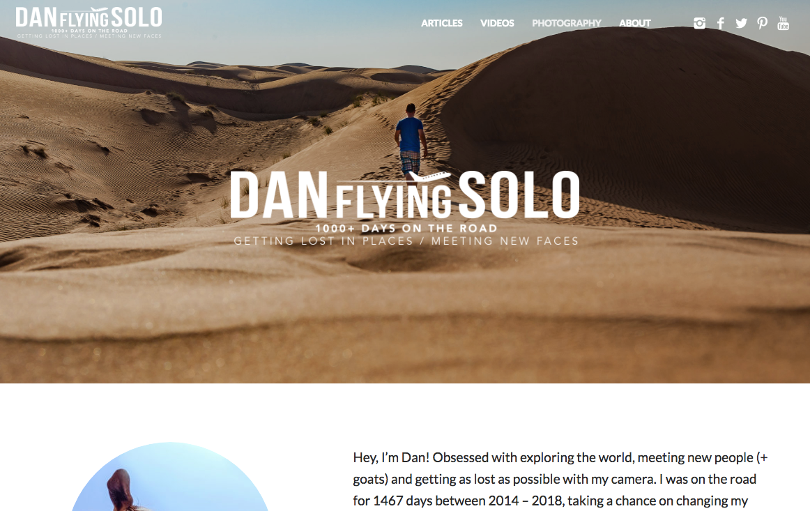
Dan Flying Solo is a personal travel blog, providing visitors with travel inspiration.
The site has a unique organization compared to other travel blogs.
Instead of being organized by topic categories, it has organization by type of content. The top navigation menu has sections for articles, videos, and photos.
Like the other best travel blog website designs, this one has prominent social media buttons, so visitors can continue to connect with the website on social media.
One thing to highlight especially is how the site has page-wide article featured images with text on top of the images.
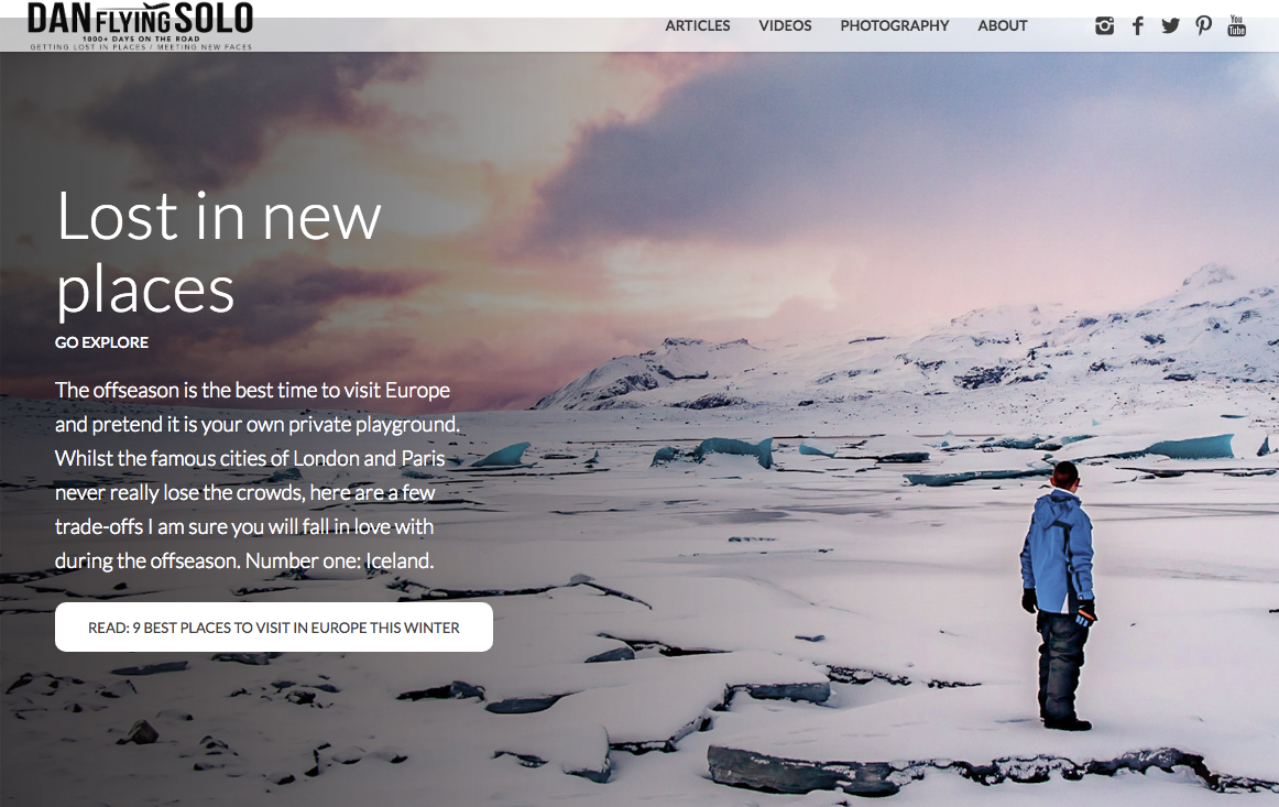
The beautiful images with the text laid over have an aesethetic that kind of reminds us of a Netflix video page, with the title and description to the left of the visual content. Here, it totally works.
Lili’s Travel Plans
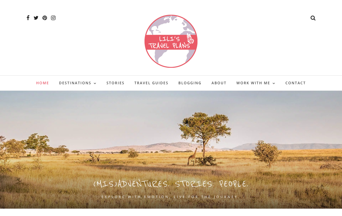
Here’s an example of a bright, fun travel blog design.
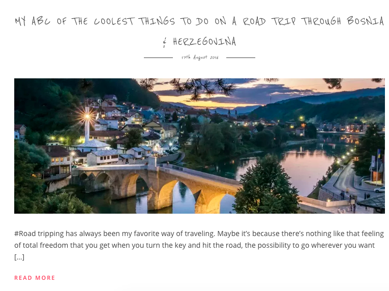
Lili’s Travel Plans is a personal travel blog. The author has a great voice, with a blog that is well-adapted for social media. All of the images can be pinned to Pinterest.
A lot of the blog posts feature embeds from her Instagram account. This site clearly knows how to have an integrated social media strategy with its website.
One other feature that stands out is the heading typeface. The font has a handwriting style, making the blog feel more like a personal journal.
Among the other best travel blog website designs, it is a less common feature, but we really like it. It adds for some personality.
My Life’s a Movie
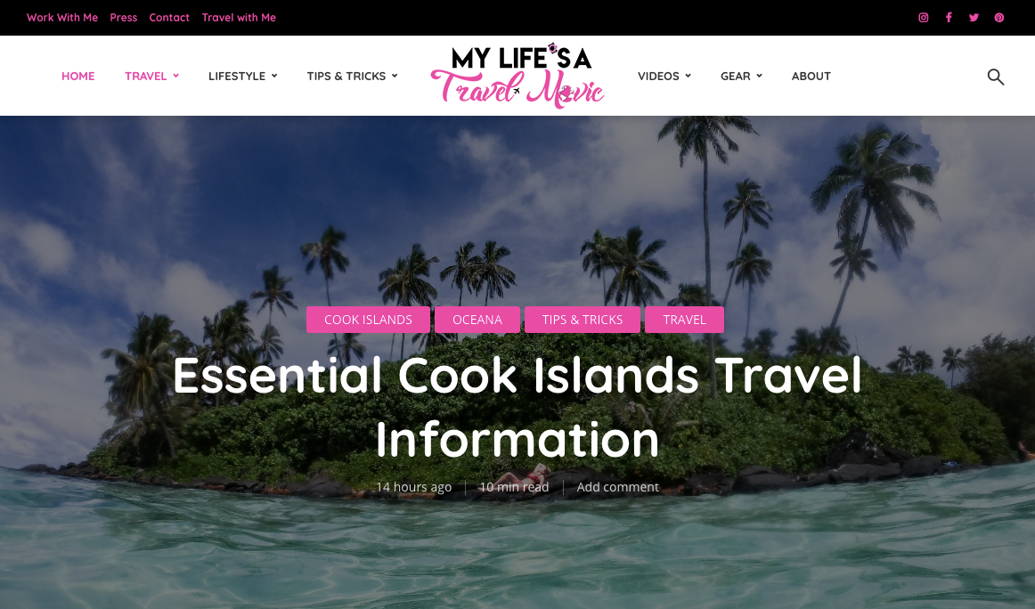
This blog stands out for its beautiful pictures as well as its bright color scheme.
My Life’s a Movie is a travel blog created by a female traveler, geared towards an audience of adventure-seeking female travelers.
One thing to point out that sets this blog apart (it’s a pretty small thing but great nonetheless) is the “read time” at the top of each blog post.
It’s a blog feature that’s become increasingly more common, as it’s been a key element in the Medium blog platform.
That aside, the blog posts all utilize a ton of tags, so you can easily find similar content to what you are reading.
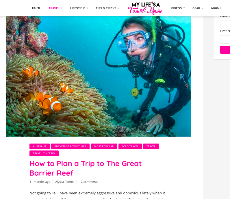
The site has a color scheme that pops and stands out, with its bright pink accent color.
Nomadic Boys
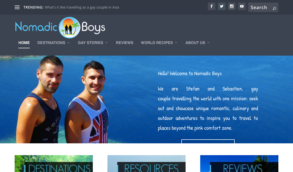
Last but not least on our list is Nomadic Boys, a travel blog focusing on the audience of gay travelers.
The site has a ton of great content for its audience and organizes it all extremely well.
We’ve discussed the challenge of more-established travel blogs: Having a ton of content means you have to figure out how to organize it for your visitors.
This site does it well.

Aside from the drop-down menu, the site also features its popular categories on the homepage with a nice stylistic flourish.

As far as design goes, we really liked the homepage. As you scroll down, the main hero image is a parallax-style image. That looks awesome, and it’s not a common element we’ve seen among many travel blogs. It’s underutilized, and this site shows off a paralalx image can make your site stand out.
If your travel blog targets a specific audience, take some cues from this site.
One other thing we love about this site design is how it works with social media.
At the bottom of every post is a link to share on social media. They also prominently feature their Instagram, and have a top-bar section with all of their social media accounts.
Wrapping Up The Best Travel Blog Website Designs
Hope this provided you some serious design inspiration for your next travel blog website design.
We had a lot of fun reviewing these blogs. They made us want to get out, explore, and take better pictures.
If you think we missed a great travel blog website design, please let us know!
3 comments on “17 Best Travel Blog Website Designs (2019)”
Leave a Reply
Free 14-day trial. Easy setup. Cancel any time.
get everything for only $9/month
Resources
Comparisons
Solutions
Products
Features
About Offsprout
Offsprout was founded by two former college freshman roommates. Drawing from their experience building their web design business, JurisPage, which was acquired in 2016, Offsprout is singularly focused on being the best white label website building tool for web design businesses.

I read your blog and I found out about this . I need your other information. thank’s for sharing
Its very informative article. thank’s for sharing
Thanks a lot for your share. Your blog help me a lot on my way to be a blogger.