The Top 9 Tips for Creating a High Converting Landing Page
November 15th
Andy
Offsprout is the only WordPress website builder for freelancers and agencies.
I’ve got great news. You don’t have to be a rocket scientist  to create a high converting landing page.
However, it does take time and expereince to find the right mix.
Lucky for you, I’m going to share the insights I’ve gained over the years to help you create landing pages that converts from day 1.
Why? Because, I know what it’s like to build out a marketing campaign, spend thousands of dollars on advertising to drive traffic, and then not see a worthwhile return.
And plus:
/Bad landing pages make all your marketing efforts – the time, strategy, the spend – all for nothing./
But before we jump in, for those of you new to landing pags, let’s start with the basics. Then, we can get into my top tips for creating a high converting landing page.
Real Quick: What is a Landing Page and What Does it Do?
Landing pages are webpages tailored to the visitors coming to your website from your marketing campaigns.

A good marketing campaign will not just send visitors to a homepage.
Instead, it will send them to a landing page created especially the campaign.
Good landing pages turn your website visitors into real prospective customers.
But, creating high converting landing pages is a mix of art and data.
Building a successful landing page requires having the right layout and elements to best ensure that your visitors take an action, whether it is signing up for a demo, buying your product, or downloading your ebook.
What makes for a good landing page? Let’s dive into the tips.
9 Proven Tips to Create High Converting Landing Pages
1. Use the Right Landing Page Builder
Creating landing pages and getting everything “just right” can be time-consuming project.
If you are working with the wrong landing page builder, building and tweaking landing pages ends up being incredibly frustrating.
Starting at the very beginning, before we get into the details of landing page elements, you will first need to be working with the right tools. You will need to be working with a landing page builder that will help you easily build a customized landing page tailored towards your target audience to help you reach your marketing goals.
There are a lot of landing page builders out there.
The landing page builder you end up using should be one that has templates you can use as a starting point. It should have an intuitive editor that lets you easily modify and tweak your landing pages. It should also connect seamlessly with your preferred contact form and email marketing software.
There are standalone landing page builder apps. These are apps like Unbounce and Leadpages.
There are also landing page builders that are built into popular CMSs like WordPress.
I believe the best way to create high converting landing pages is by building them in the same place my website exists, this way I have everything related to the website all in one place.
There are many tools that will allow you to do this however, my personal preference is Offsprout (although I am a bit biased 😉 ).
Offsprout is a complete website builder that has a ton of options for building great landing pages.
It’s a website builder built on top of WordPress, so it integrates with all the form and analytics plugins you will likely want to use, like Gravity Forms, CallRail, and Google Analytics.
Whatever landing page builder you choose, make sure you choose one that works with the rest of your marketing stack.
There’s nothing more frustrating than having your data scattered in different places. That makes a ton more work for you to try and figure out if your campaigns are going well.
2. Your Landing Page Should Have Only One Goal
A landing page can be any webpage.
Sometimes, your homepage can be a landing page.
But, I do not recommend it.
Using homepages as a landing page drives me crazy.
One reason I hate it when businesses use their homepage as their landing page is that website visitors can go in very different directions when they get to the homepage.
There are many different paths they can take from that homepage. They can start reading about your products and services, features, your blog, tutorials, etc. And then they go down a rabbit hole and leave your website without converting.
A good landing page is simple, with a singular mission (hint: conversion).
Your landing page should have a specific goal in mind, whether it is to download a piece of content and get on your mailing list, sign up for a demo, or buy your product.
Nothing else.
No side-quests on this landing page.
To that end, there should not be too many options on your landing page.
3. Keep it Simple
Though you have a single goal, it can get easy to get lost in the weeds with your landing page layout and copy.
Less is more.
Though you may want to throw everything at your visitors – mentioning everything your company can do, have tons of images, videos, and testimonials – you need to keep it simple.
Your landing page should have a simple layout or theme.
It might seem to you like it’s not enough to compel visitors to take an action.
But it’s all you need.
If someone clicks a link to your landing page from an ad, they are interested in what you have to say.
All you have to do is nudge them to take the action. Just don’t overwhelm them so much that they get second thoughts.
Don’t throw everything you have at your visitor because you are just excited that you have visitors coming to your website.
That ends up confusing them and they end up leaving.
One thing I like to do is start from the goal and work my way backwards.
Let’s say that I want to get people to sign up for a product demo.
My landing page will then need a form so visitors can sign up for a product demo.
There should be no other forms on the landing page.
Also, there should be nothing else to distract the visitor from reaching that goal.
I prefer all my landing pages to be one page with limited navigation menus.
I don’t like to have navigation menus on my landing pages to other webpages or blog articles because then visitors can end up going to those pages, getting distracted or lost, and not converting.
Here is an example of a landing page for Offsprout.
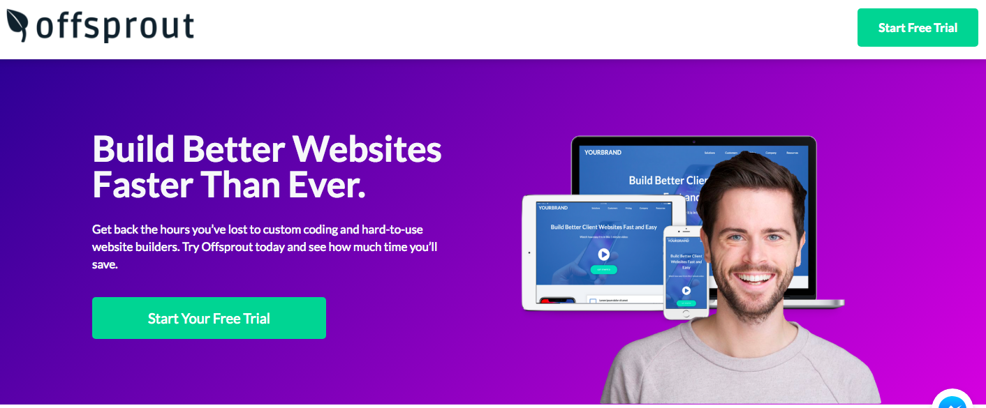
Notice how the goal on this page is simple. The only thing the visitor should be thinking of doing is taking a free trial.
The copy highlights benefits, not features, and directs visitors to take the action.
Remember – your landing page should have one goal. Everything on the webpage that does not contribute to helping your visitor reach the goal is a distraction and should be removed.
This mantra should help you when it comes to writing your text and copy for the landing page.
Speaking of which, let’s talk about copy.
4. Create Compelling Landing Page Copy
If you want a high converting landing page, your landing page copy needs to sell your visitor.
You cannot do it on images alone. You need text to convince your visitors to convert.
Selling in text can be tough, though.
How do you connect with your visitor without being too aggressive, too cheesy, too long-winded, or too boring?
I have a few recommendations for that.
Sell “Benefits”, not “Features”
One old tip from salespeople is to sell your prospective customer on the benefits of your product or service, not the features.
Your visitors don’t care chiefly about what your product does.
They care about what your product can do for them.
Let’s take an example. As a potential customer, which message would you rather hear? “This car has 4 airbags” or “This car will keep you alive if you get into an accident.”
The airbags are a feature. But the benefit is that you don’t die in an accident.
Let’s take another example. Say you are running a web design agency. A feature of your service may be “Mobile-responsive design” but the benefit you get from that feature is, “Convert visitors coming to your website from mobile devices.”
This does not mean you cannot mention your features. You can. But, the benefits should be the real focus.
Use Short Sentences
In my experience, landing page copy with shorter sentences are more “digestible.”
Long-winded sentences mean the reader needs to have more focus. We want to make things as simple as possible for your visitors so they can reach that goal.
I know that your product or service may be so amazing and intricate that you need to get into minute detail.
But, if you have huge paragraphs of text on your landing page, you will lose the reader’s attention.
Generally, I find that people coming to landing pages have a very short attention span.
Put yourself in their shoes.
You have just clicked on an ad or a link and are coming to a landing page. You have many things around you fighting for your attention.
This landing page better explain itself in a few seconds, otherwise you will leave.
Being able to keep your sentences short takes skill.
It takes a lot more work to be able to say things in fewer words.
When I was in school, I hated page limits because I tended to be long-winded in my writing.
I could fill up pages without a problem. But, if I had a maximum page limit, it forced me to think harder about what I wanted to say and work to convey those ideas more concisely.
Keep a Conversational Tone
One thing it took me awhile to learn when building marketing campaigns was how to write in the right style.
What I have found most effective is writing in a more “conversational” style.
I write as if I am having a conversation with the reader, explaining an idea to them.
When I write landing page copy, I try and imagine myself saying these words out loud.
I do this because I know that when people are reading text, they often read it “out loud” in their heads.
And cheesy language or too formal language tends to be grating. It slows the reader down. It stops them. And it hinders them from getting to that end goal.
So, when you are writing and reviewing your short sentences of landing page copy, I might recommend trying to read the copy out loud first. If the text sounds cheesy, stilted, or boring, it’s time to make some changes.
Write for the Conversion
Just like we talked about earlier, your page should have one goal.
The text should get visitors to that goal. Reading the text, it should be clear that they need to convert on your page. Keep your writing focused on that goal.
When reviewing your text before publishing it, ask yourself if the copy does a good enough job getting you to take action.
Does the text adequately address their concerns and get past any objections they might have?
Does the text “ask for the sale”?
Use Hemingway App to Edit Your Text
Now, I know that I mentioned you should write simply and use short sentences. But, without someone to proofread your writing, you may not know what needs improvement.
Luckily, there is a free tool out there that can help you with your writing.
Hemingway App is an online text editing tool that helps you refine your writing. It grades your text readability and lets you know if your sentences are too difficult to read.
I use it with every blog post and page that I write.
Yes, even this blog post too.
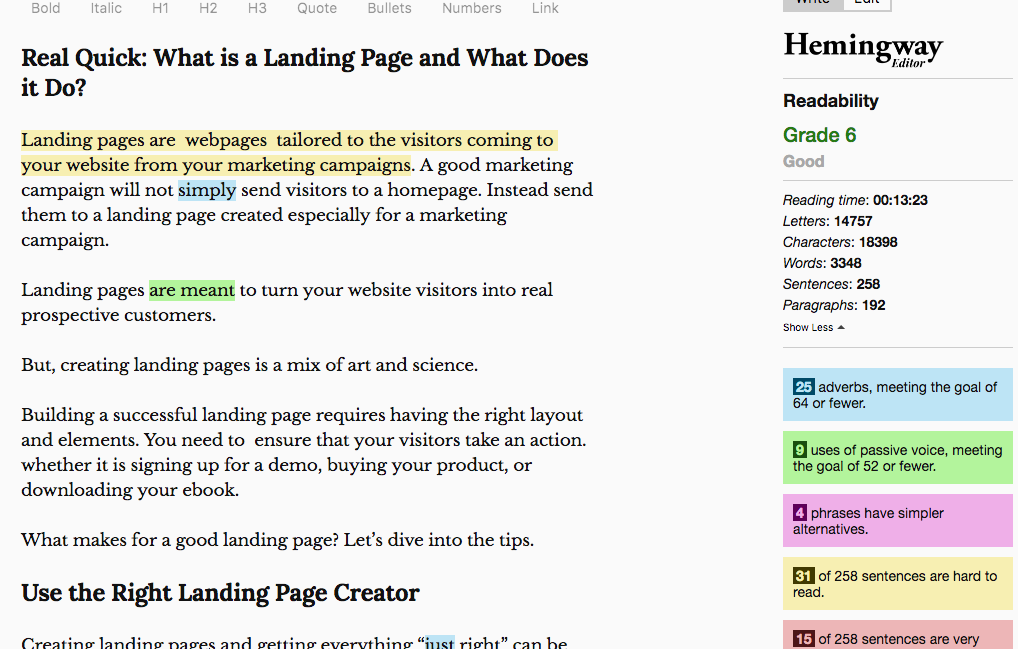
Over time, using Hemingway App will also improve your writing. When I first started using Hemingway App, most of my text was flagged as “very hard to read.” Over time, my writing evolved. I learned how to write easier-to-read sentences and saw fewer red flags in Hemingway.
Just like having the right landing page builder in your arsenal is vital, so is having good proofreading.
5. Your Landing Page Needs to Look Good on Every Device
This tip basically comes in two parts:
1) don’t ignore mobile devices; and
2) test everything.
First, your landing page builder needs to be able to build landing pages that are responsive.
If your landing page builder cannot build mobile-responsive landing pages, this is a deal-breaker. Immediately find a new landing page builder.
Every year, more and more traffic is coming from mobile devices.
Last I checked, over 50% of Internet traffic was coming from mobile devices. And it has only been increasing year over year.
Your visitors will not be an exception to this rule.
Whether you are selling web design services, digital products, or goods in an online store, a many of your visitors are coming from mobile phones.
So, if you want to craft high converting landing pages don’t forget to make sure they’re mobile friendly.
But, beyond that, make sure that your landing pages actually look good on mobile devices and will convert your visitors.
Don’t just take your landing page builder’s word for it.
Many landing page builders say that their landing pages are mobile-responsive, but you should absolutely test out these landing pages on mobile devices.
When you are building your landing pages, you are most likely doing it on a desktop computer.
You are also probably reviewing those landing pages on a desktop. Do not forget to try and check out the landing pages on your phone.
Or, if your landing page builder has an option, see what a mobile rendering of your landing page looks like.
On mobile devices, sometimes landing pages can look weird.
There can be too much text for a mobile visitor.
Images or objects can show up in the wrong places.
Things can easily be out of order for what you’d want someone scrolling down a narrow screen to see.
Calls to action can feel less compelling.
This is why you must must must always review your landing pages on mobile devices before publishing them. Otherwise, you may waste a ton of time and money.
You may find that you need a different layout entirely for a mobile visitor. Things on a mobile screen need to be simple, yet accessible for the reader. Since their screens are narrow and they are reading in a slimmer screen size, you may need to tweak your content.
6. Have a Striking Call to Action
To get your visitor to take the action needed to reach your goal, you need a “call to action”.
The call to action is your “ask”.
For landing pages, your call to action is going to be a button.
A good call-to-action button pops.
Its color should contrast with the read of the landing page so it stands out.
The CTA button should be large enough that it stands out and draws attention.
I recommend using orange as a CTA button color.
Orange pops real nice.
Some exceptions apply (e.g. the rest of your landing page is also orange or the orange doesn’t go with the page color scheme).
If you are working with a landing page builder, often there are call to action button templates.
Make sure that your button does not blend into the background. If your button does not stand out, visitors will not know where they need to go.
Make it easy for them and make the CTA very noticeable.
Aside from the button design, it should also have text that visitors can easily read.
There should be no question of where you want your visitor to go.
And, your CTA text should be compelling.
It should have an ask.
Your CTA should have an action verb in it.
“Get this ebook now.”
“Start a free trial.”
The last thing you want is to use “Submit” as the CTA button.
So many contact forms have a button that says “Submit”.
It’s a default.
But, it says nothing about the action you are taking.
It’s weak.
You need a compelling call-to-action. Your CTA should make visitors want to take the action.
7. Social Proof: Let Other People Do the Selling for You
One challenging thing about landing page text is that no matter how much you say about how great your service is, it comes across as salesy.
Obviously, you should think your service or product is great and be conveying that to visitors.
But, they take what you are saying with a grain of salt.
You want people to think your service is the best because you want visitors to pay you money.
You have a vested interest in visitors taking action.
So, landing pages copy can make visitors skeptical.
One way to get past that is with social proof.
Social proof is validation of your product or service from third-parties.
Social proof is customer testimonials.
It’s a “Featured in” bar with company logos.
It’s numbers of total downloads and sign-ups.
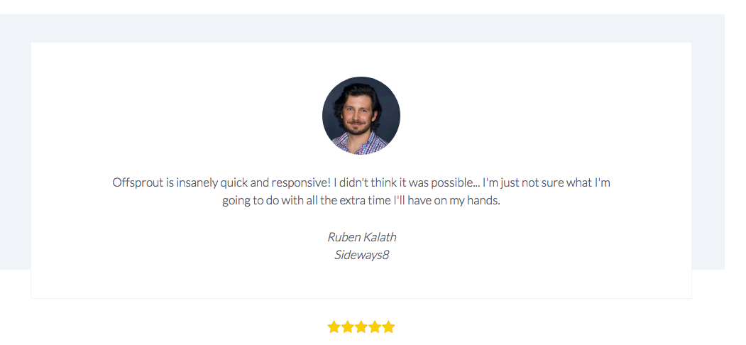
People feel more comfortable in numbers.
When people are not sure what to do, they take solace in knowing that others have taken the same path. It makes decision-making easier.
This concept comes from a great book on psychology, marketing, and persuasion – Influence, by Robert Cialdini.
Think about this – when you go to Amazon to buy a product, you are more likely to buy a product if it has a lot of reviews rather than no reviews.
On your landing page, use social proof to persuade your visitors.
Use social proof to assuage any fears or concerns about the unknown.
Your visitors don’t know if your product is any good or if you are lying when you say it is the best thing ever, but your satisfied customers can help persuade.
8. Keep Your CTA Form Simple
Your landing page will likely have a form to capture your visitor’s email address, contact information, or credit card number.
Keep your CTA as simple as possible.
Have no more form fields than absolutely necessary.
More fields means more friction.
If people have to fill out a questionnaire with 8 fields before they can click submit, they will be less likely to fill out your form.
Every additional form field is one more piece of friction and will likely hinder your conversion.
One to three fields is ideal.
That being said, this should not be taken as the end-all, be-all.
Which brings me to the next tip…
9. Question Everything. Test Everything.
You should be constantly testing out your landing pages to see how you can improve them.
Test out variables.
Try altering things on your landing pages, one variable at a time, and see which landing page variant performs better.
For example, you can A/B test:
- CTA button design
- CTA button text
- Landing page layout
- Form field size
- Social proof elements
- Page headlines
Even if you think you are getting good results, you can always be doing better.
Try testing out every variable until there are no improvements left to be made.
Also, one word of caution – don’t be too quick to judge the data.
One conversion on a landing page variant compared to two conversions on another landing page variant is not likely going to be statistically significant.
You need enough traffic, data, and conversions before you can choose a winning landing page variant.
Don’t be hasty to choose a winner before you have a sizeable amount of data so you can make an informed decision.
Conclusion
With these tips, you will be able to easily build a high converting landing page that will drive the results you need for your business.
Get the right landing page builder, find the right templates for inspiration, and start building those landing pages that convert!
Free 14-day trial. Easy setup. Cancel any time.
get everything for only $9/month
Resources
Comparisons
Solutions
Products
Features
About Offsprout
Offsprout was founded by two former college freshman roommates. Drawing from their experience building their web design business, JurisPage, which was acquired in 2016, Offsprout is singularly focused on being the best white label website building tool for web design businesses.