The 18 Best Google Fonts for Web Designers (2018 Edition)
September 13th
Andy
Offsprout is the only WordPress website builder for freelancers and agencies.
When trying to find fonts for your latest web design project, you may have come across different font repositories online. After scouring for awhile, you may have found the perfect font for your project, until you realized that to use the font it would cost you money.
But, there are tons of free fonts at your disposal. For example, Google Fonts.
Launched in 2010, Google Fonts is the largest free, open-source repository of fonts out there.
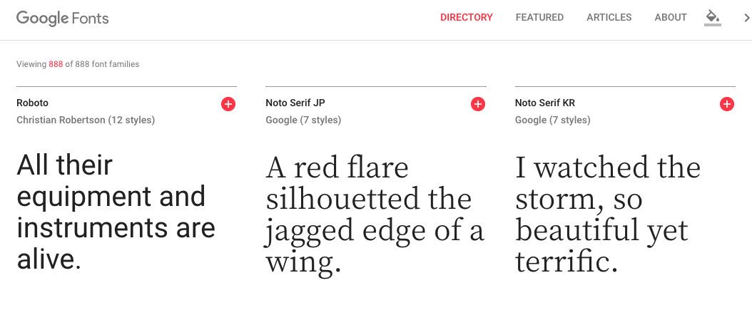
It’s free to use any font from Google Fonts for either commercial or personal use. So, you do not have to worry about any license issues if you want to use a particular font on a website, logo, or other project.
Why Use Google Fonts for Your Web Design Project?
There are a few key things that make these fonts best choice for most web design projects.
First, all they are free.
There is no fee to download…ever.
Second, there are no license restrictions.
You can use any font from Google Fonts in any medium you chose, whether it’s a personal or commercial use, on the web or in print.
Third, they play very well with websites and are easy to implement.
Google Fonts was built with websites in mind.
You can get Google Fonts to show up on your website by adding a link in your website’s CSS stylesheet to a particula font family, and then styling an element in either the stylesheet or directly inline in an element.
Even better, they load quickly via Google’s CDN as compared with self-hosted fonts.
As page load speed is important to web designers, clients, and website visitors, using a font service that does not slow down your website is critical.
Finding the Perfect Font for Your Web Design Project
There are a lot of fonts on Google Fonts. As of this article publication, there are 888 different font families – with more getting added constantly.
Scrolling through all 888 of them to find the right one for your particular use would not be a great use of your time. Thankfully, there is a robust search engine to help you find the most appropriate font for your situation.
Need a serif font with a particular slant and thickness? Just check a few boxes and you’re all set.
But, the search functionality is not the most useful if you do not know what you are looking for or want some inspiration or particular themes. As far as font galleries go, the main drawback you might notice is that it does not have helpful categories for things like fonts with a particular style, like “sci-fi”, “deco”, “comic”, or “typewriter”.
The Best Google Fonts for Web Designers
As we mentioned there are a ton of free fonts to choose from. But which ones are the best for your project?
To help you out, we’ve curated a selection of our favorite Google Fonts for web designers. We’ve categorized them apart based on font style: serif, sans-serif, display, handwriting, and monospace.
Here are our top picks….
Best Sans-Serif Fonts for Web Designers
First, a quick discussion of what sans-serif fonts are.
Sans-serif fonts are fonts that do not have little flourishes on their edges. One example of a sans-serif font is Arial. Compare that with the popular serif font of Times New Roman.
Sans-serif fonts are typically associated with the web.
They are easy to read and more legible from a distance as compared to serif fonts. As such, they are generally preferred when it comes to text on computer screens. Website copy is most often in sans-serif.
Now, on to our picks for the best sans-serif fonts for web designers.
Open Sans
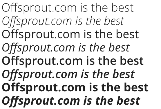
Does this font look vaguely familiar? You may notice that Google uses it on a lot of their websites and ads.
Open Sans is a sans-serif font, originally commissioned by Google.
It is very legible, easily readable on screens. For web designers, Open Sans works well for flat design styles. It is the second-most used font on Google Fonts.
So, if you are looking to use a font that is a bit more obscure, this is not the one for you.
Roboto
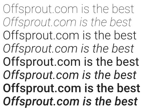
This font is the most-popular font in the Google Fonts library. And it’s understandable why. It’s a sexy font.
This may be the first time I’ve ever called a font “sexy”.
Roboto is a sans-serif font. It was developed by Google specifically as the font for the Android operating system. Today, it is the default font of Google+,Google Play, YouTube, Google Maps, and mobile Google search.
In its description, Roboto is described as having a “dual nature” where “It has a mechanical skeleton and the forms are largely geometric. At the same time, the font features friendly and open curves.”
Montserrat
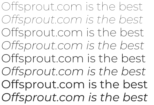
This sans-serif font was inspired by old posters and signs in the Montserrat neighborhood of Buenos Aires, Argentina.
Montserrat has a very clean look, with nicely-rounded lines.
Lato
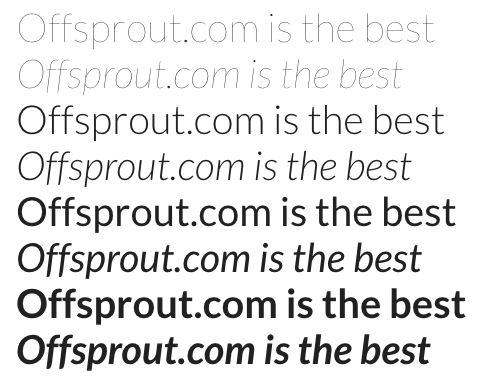
So many options. Lato has a lot of different weights and styles to choose from – thin, light, regular, bold, black – and all in italics. If you are looking to have one particular font family with different styles throughout your web design project, Lato might be the right option for you. This font works well either as a heading or body text.
Rubik
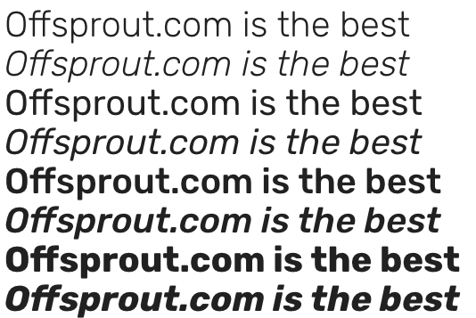
Rubik is another sans-serif font with a lot of different options to it. Rubik has a unique look for a sans-serif font with slightly rounded corners. If you are getting sick of Roboto and Open Sans, Rubik might be a good change of pace.
Best Serif Fonts for Web Designers
Serif fonts are fonts that, unlike sans-serif fonts, have flourishes on their edges. Fonts like Times New Roman, Georgia, Garamond, and Courier are a few examples of common serif fonts.
Let’s jump into our top picks for Serif fonts.
Merriweather
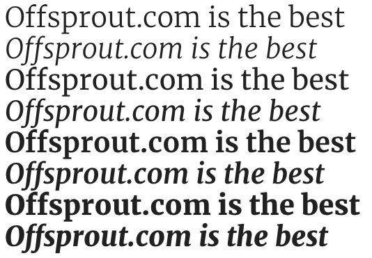
Merriweather was designed specifically to be readable on screens. It has a lot of options that come with it of different font weights and styles like light, normal, bold, ultra-bold, and each of those has an italics option. There is also a sans-serif version of Merriweather that works well alongside the serif version.
Roboto Slab
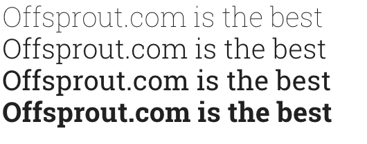
If you Roboto, but want serifs, check out Roboto Slab.
The only drawback with Roboto Slab is that there are a limited amount of options – thin, light, regular, and bold, with no italics options.
PT Serif
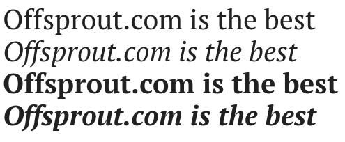
PT Serif is a font with an interesting backstory. It was commissioned in 2009 by the Russian government in honor of the 300th anniversary of Peter the Great’s reforms to the Russian alphabet.
A drawback with this font is that it has the most limited options of any of the fonts on our list – there is only a regular, bold, and italic version of both.
Noto Serif
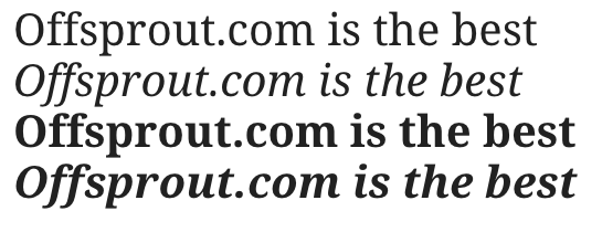
Noto Serif is part of the Noto font family, a font that was commissioned by Google. It was designed specifically to create visual harmony (i.e. comparable stroke thickness and heights) across multiple languages and scripts.
Lora
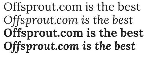
Lora is a font that is well-suited for body text. Inspired by calligraphy, its brushed curves and plunging serifs give a very unique look that convey a mood of a modern story. Though we are focusing on fonts that would be good in particular for web designers, Lora would also work well in print.
Best Display Fonts for Web Designers
Display fonts are typefaces that are intended to be used at large sizes for headings, rather than for body text.
They are a bit funkier, more exotic or abstract than typical fonts meant for body text.
Comfortaa

This display font looks great in headings. It has a rounded, geometric look.
Comfortaa pairs well with sans-serif fonts like Open Sans or Roboto.
Lobster

This one is really cool. Lobster, built in the Open Type format, has multiple versions of each letter, and connects letters in the same word. Based on the context of a letter inside each word, a different variant of a letter may be used automatically (so long as your browser supports ligatures).
Poiret One

I am a sucker for a good art deco typeface. Poiret One is a light, elegant, sleek font with great curves. It is reminiscent of an art deco style and would look great on titles and headings.
Rokkitt
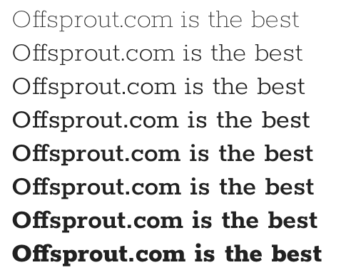
Rokkit is a serif font inspired by geometric slab serif fonts that were popular in the late 1800s to early 1900s. It is best used for headings, though it could be used as an alternative to a sans serif font for body text.
Quicksand
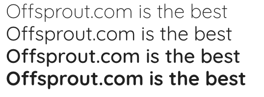
Quicksand is a sans-serif style display font with a very rounded look. Being a display font, it wokrs best in large sizes, but quicksand may be usable as a body text font depending on your use case.
Other Fonts for Web Designers – Monospace and Handwriting
So, I did not want to completely shun the other fonts on Google Fonts.
The other categories are “handwriting” and “monospace”, but, I don’t think most of the fonts in these categories would work well for web designers.
Handwriting fonts are exactly what you think – fonts in a style evoking handwriting. They are often in cursive. They can be elegant, daring, natural, or sloppy. But, generally I find that they are difficult to read for body text.
Monospace fonts are fonts where each character has the same exact width. In the computer world, monospace fonts are common in computer coding applications. They have also historically been used on typewriters.
Roboto Mono
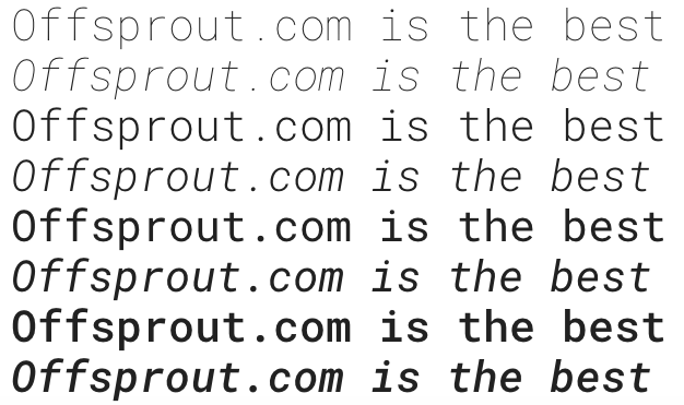
If you’re going to go with a monospace font, it better be in the Roboto family.
By this point, you may gather that I am a big fan of the Roboto font family.
Roboto Mono is a monospace font looks great in a variety of environments.
Source Code Pro
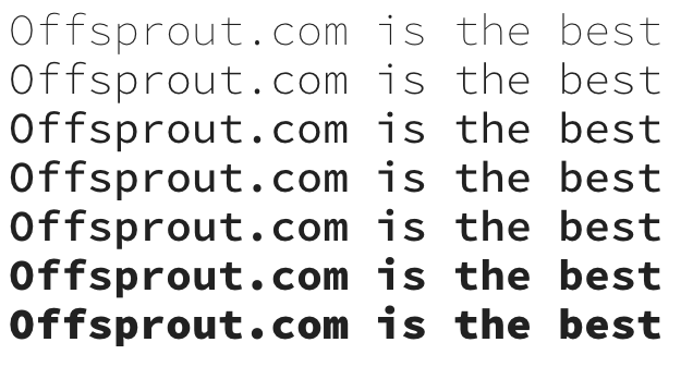
This monospace font has a strong computer coding vibe to it.
If you are looking for a header or body text font that evokes technology and has a dual retro and modern feel to it, Source Code Pro should work for your needs.
Kalam

I hate most handwriting fonts. I think they only seem to work for headings, and only in rare occasions. For the most part, they are difficult to read and are not great from a user experience perspective.
But, if I had to pick a handwriting font I did not totally hate, it would be Kalam. Kalam was derived from handwriting but optimized for text usage on screen.
How to Install a Google Font
Now that we have reviewed our favorite Google Fonts for web designers, it’s time to install these fonts on your next website project.
Here is what you will need to do:
1. Go to fonts.google.com
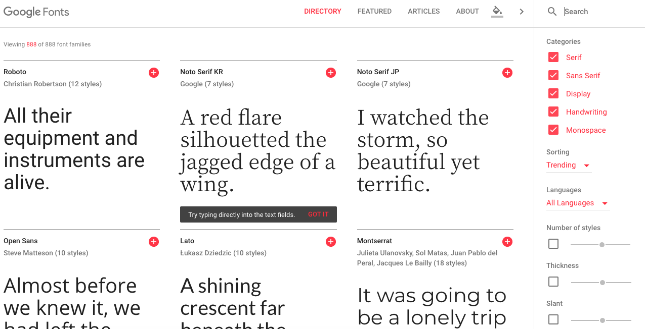
2. Search for the right font for your use
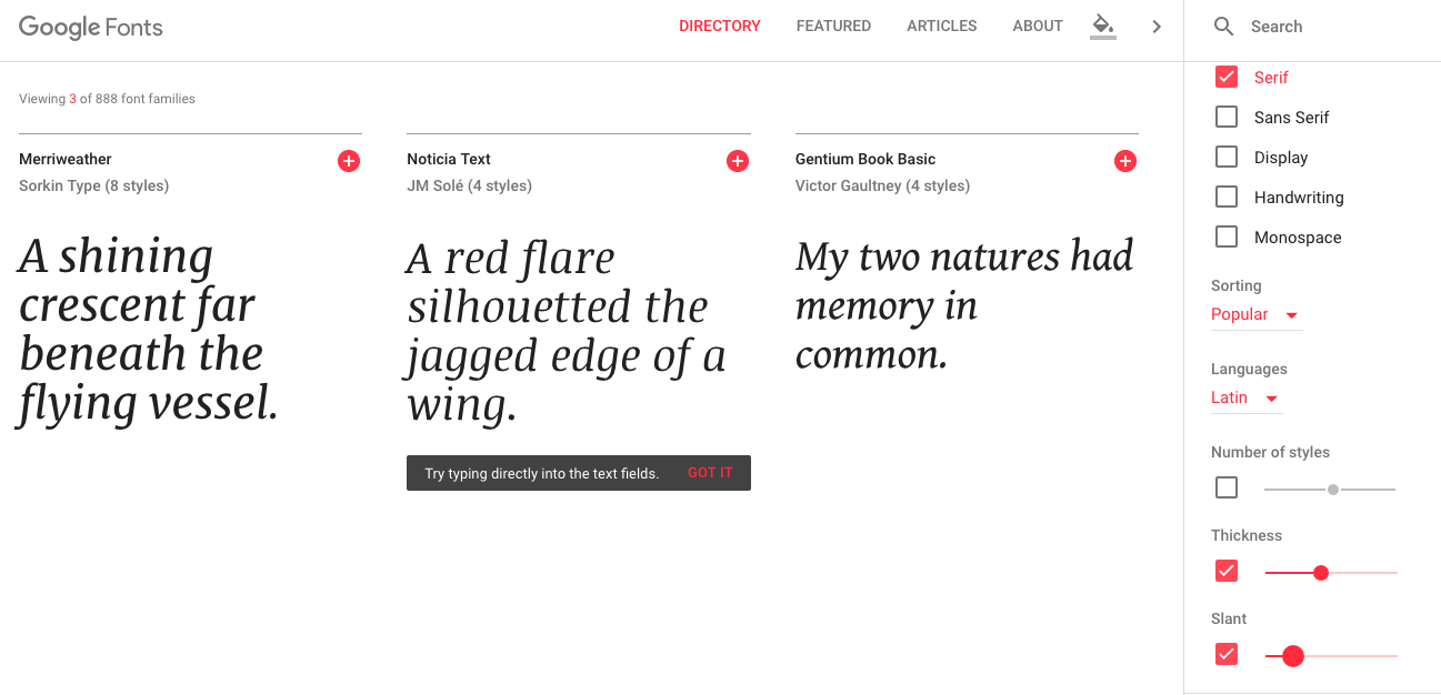
3. Pick a font by clicking the + icon next to your font
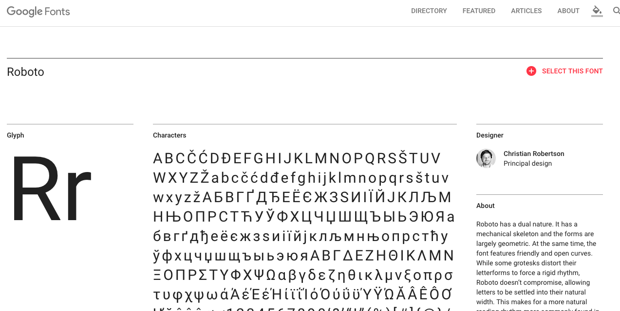
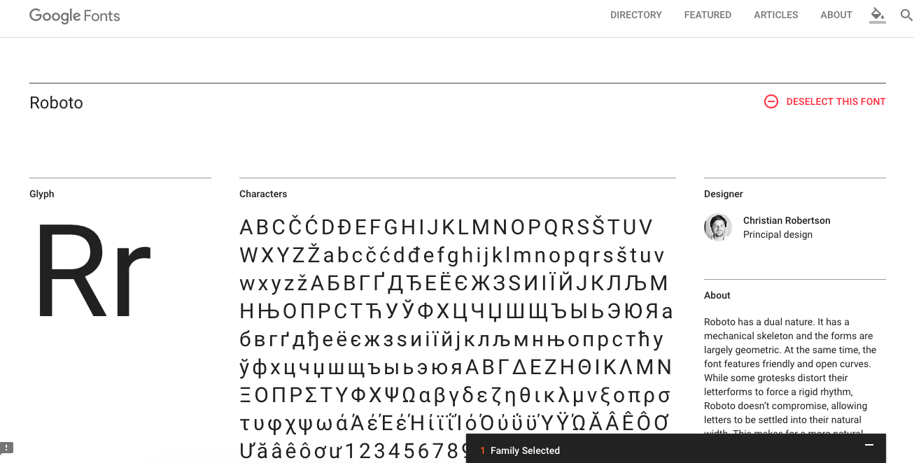
4. Bring up the selection drawer at the bottom of your screen
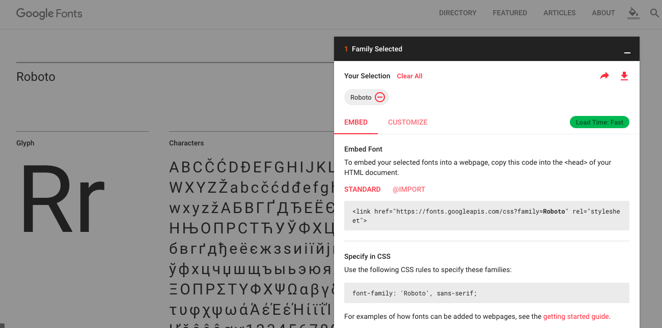
5. Copy the font’s HTML code and paste it into your website’s <head> section
6. Copy the font’s CSS code and enter it into your website’s CSS stylesheet
And that is all there is to it! Now you are ready to use your new Google Font on your website.
Conclusion
This is just a sample of the many free Google Fonts out there. For web designers, you do not want to spend hours getting lost in fonts. The fonts we’ve chosen in this article look great on screens. Some are meant only for headings, others for body text.
If you have any favorite Google Fonts we didn’t cover that you think work great for web designers, please share your feedback in the comments.
Free 14-day trial. Easy setup. Cancel any time.
get everything for only $9/month
Resources
Comparisons
Solutions
Products
Features
About Offsprout
Offsprout was founded by two former college freshman roommates. Drawing from their experience building their web design business, JurisPage, which was acquired in 2016, Offsprout is singularly focused on being the best white label website building tool for web design businesses.
